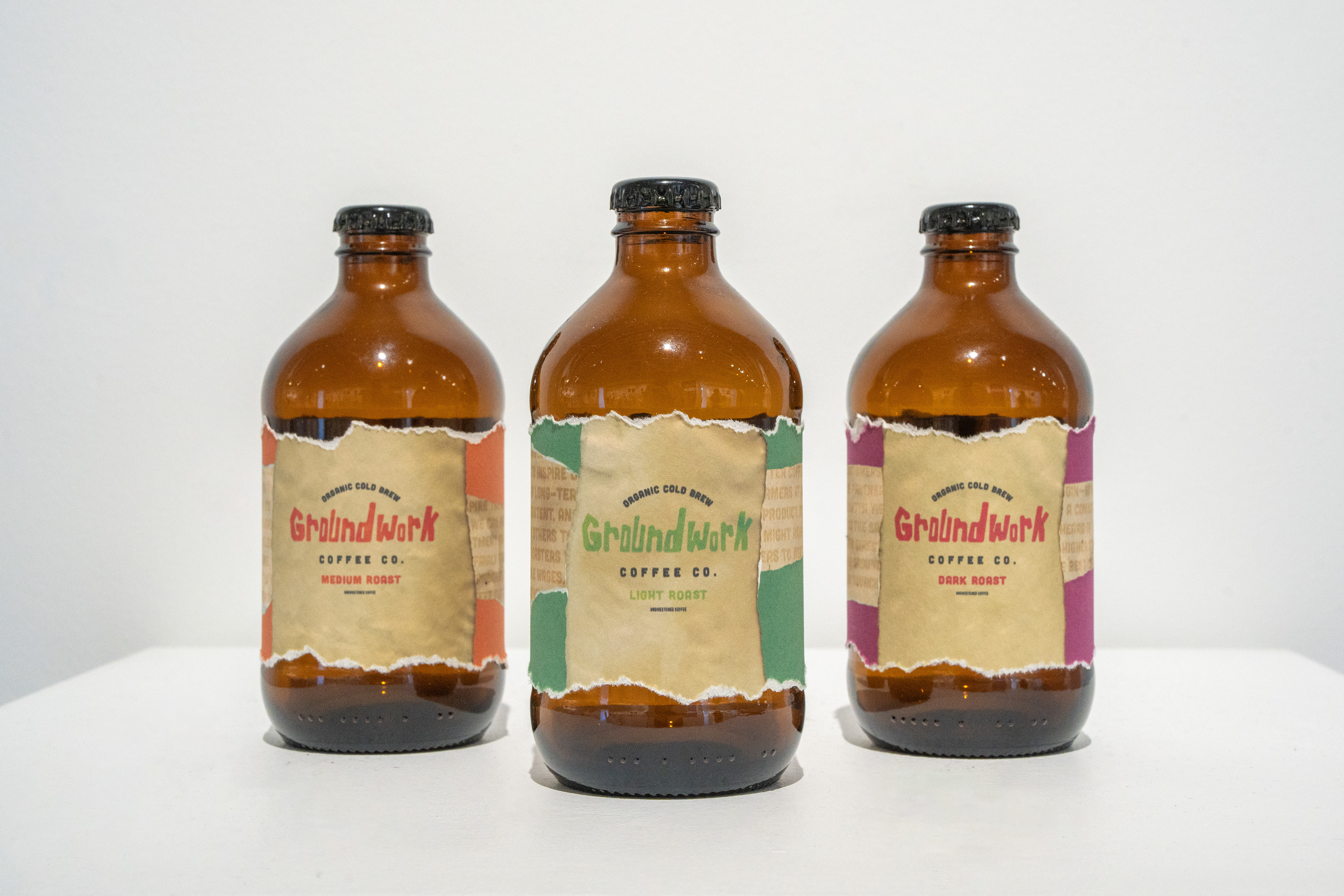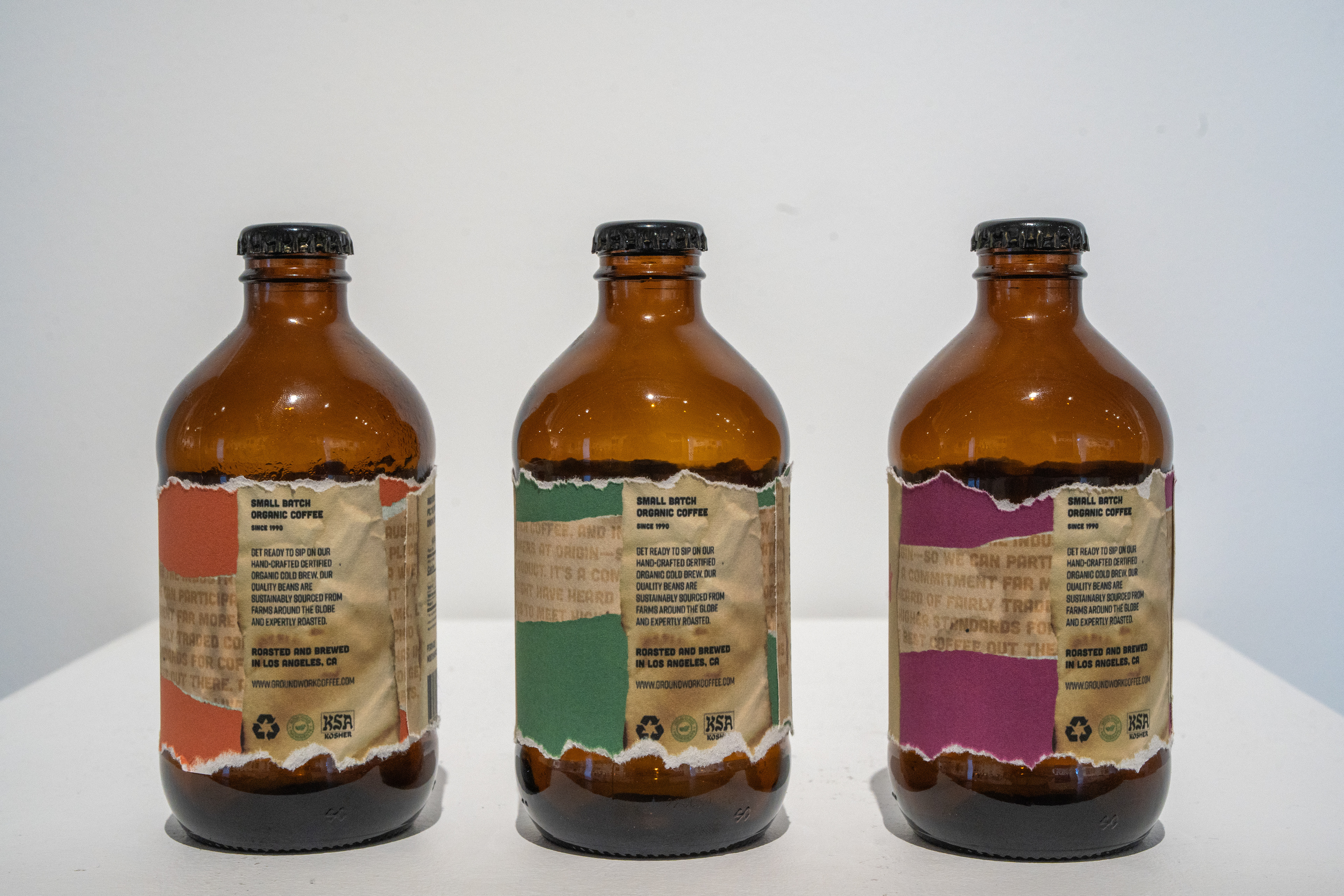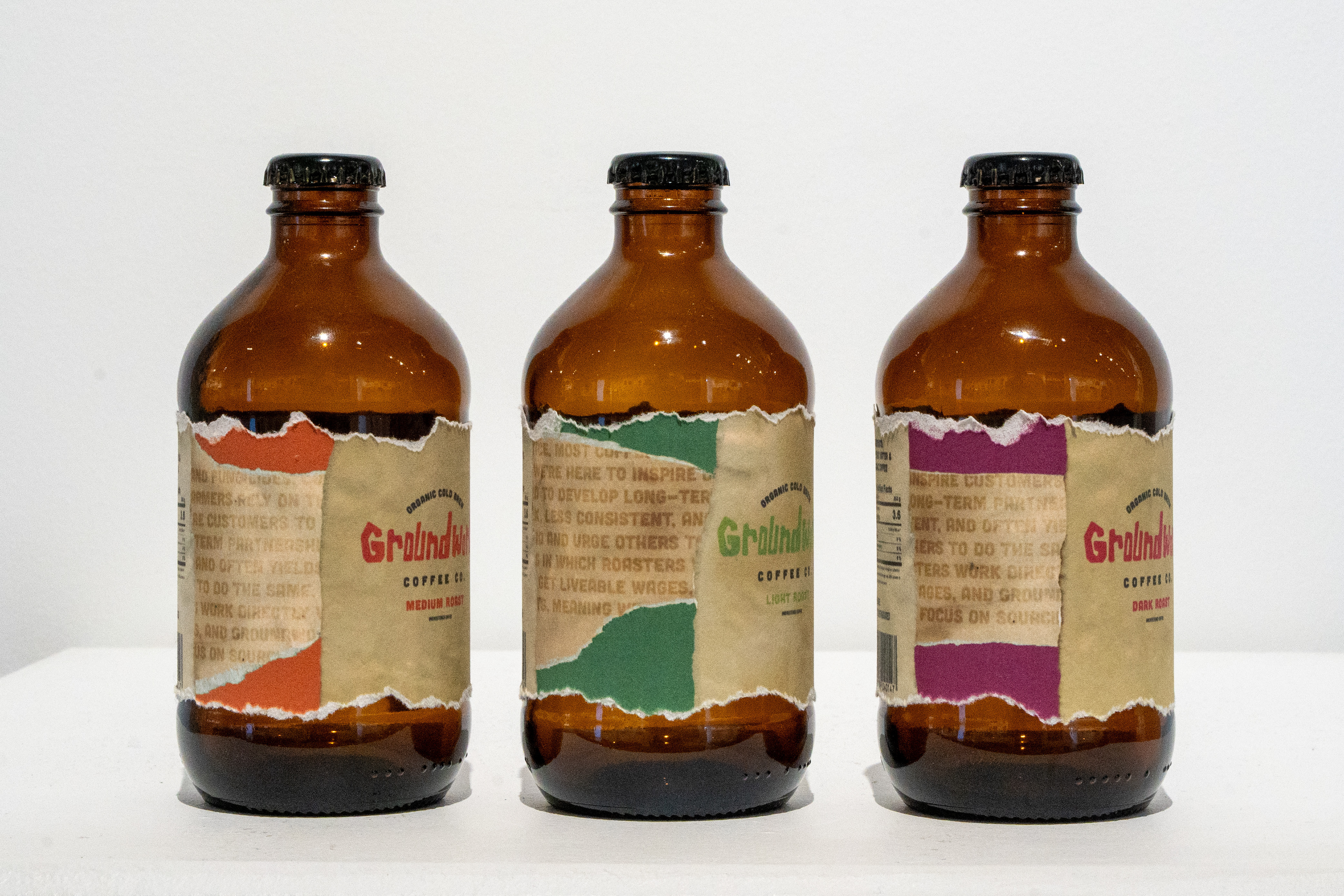
Package Design
Groundwork Coffee prides itself on being organic and also using only the best methods for producing its coffee.
I developed the logotype by hand to achieve organic energy. In doing so, I landed on imperfect typography rooted in its baseline. This is a callback to the company's coffee production methodology. It is a living logo, customizable to various flavors, as demonstrated in the three cold brew flavors.
I elaborated the concept of organic by piecing together hand-stained coffee scraps to form the beverage label. Featured are multiple overlapping scraps that I stained myself using Groundwork Cold Brew. To add back dimension, I also added a torn piece of crisp colored paper to create a unique and lively brand. To elevate it to its total capacity, the borders of the labels are torn to enhance the coffee's organicism.